Brit's Wine
Brit's Wine is an app that wants to make the experience of discovering new wine less confusing for millennials and generation X.

Project Goal
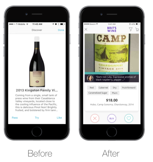
The goal was to redesign the first version of Brit's Wine app, focusing on creating a delightful experience with a Tinder-like swiping mechanism to learn about users’ tastes.
This feature was the core requirement of the app, aiming to present a fun and easy way to discover new wine matches according to users’ individual preferences.
The team

About my role
I led a team of 5 designers in creating the second version of the app within a 7 week time frame.
My main responsibility was to handle the client communication and presentations, and lead the team's UX strategy.
Dianna Xu was my indispensable partner in co-leading the experience.
Her focus was in the management and organization, as well as the visual look and feel of the app.
We practiced collaborative techniques like design thinking, pair design, weekly design critiques and team retrospectives.
The result was one of the most comfortable and smooth teams I ever worked with.
Our design process


Design thinking and Prototyping
I led a Design Thinking workshop with the client and the whole team.
As a result, we were able to merge the app's business goals with the target users’ needs, building collaborative the first sketches of the app future Lo Fi wireframes.
Market Research
Before jumping into design, we did an extensive analysis of apps for wine and for dating.
We also ran a first round of usability tests and interviews to understand the first version of the app's pain points, as well as well as our target users needs

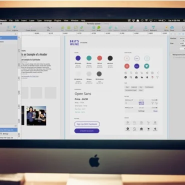
Style guide & UI elements
A Style guide it's a powerful tool to communicate with the app engineers.
With it, we were able to show the possible different states of the app, and clues to keep the consistency along the different flows.
We first worked around the app style and color palette with Style tiles.
We improved the last version while developing our Hi Fi deliverables.
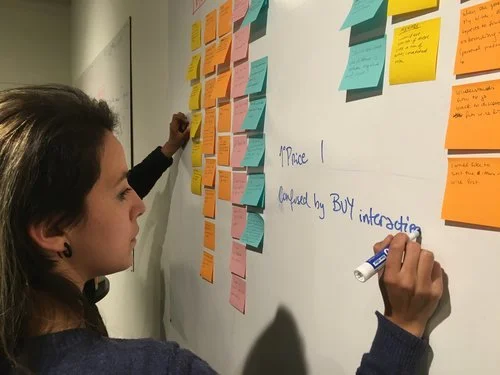
Lean cycles of testing
In 7 weeks of project, we were able to iterate and test our design ideas three times.
The first round was to have a diagnose about the app's current issues and to learn about our target users needs.
The second and third round were focused on validating the UI and AI we were proposing and adjusting it to real user needs.
AHA Moments
We found more than one persona types: Late millennials or gen X were more demanding about who and why chose the wine. They're expecting to know top sommelier's ratings on a wine as tips for food pairing regarding the taste. Younger millennials just want the suggestion without much info about it: if it works, they'll come back.
We expected users to generate a Profile with their tastes but they found it unnecessary. The section My Wines was much more relevant and easy to understand for them.
We wanted to make on boarding short and straight forward, but users didn't understand it. A longer and paused on boarding experience was easier to understand and differentiate from the app itself. Users were able to understand the goal of the app while being hooked to continue using it to discover more.
The final delivery
Every iteration was done taking into consideration our client's and real users feedback.
We included recommendations future iterations of the app, for example:
Maintaining different Sign In or Explore options at the beginning. Users appreciated having the opportunity to explore before signing in.
Exploring different ways to undo a match: at least half of the users asked for a feature that to undo a match/un-match.
Considering implementing users reviews of wines. All types of users requested for them.
Want to experience it yourself? Play with our final prototype: